PLAY
*
PLAY *
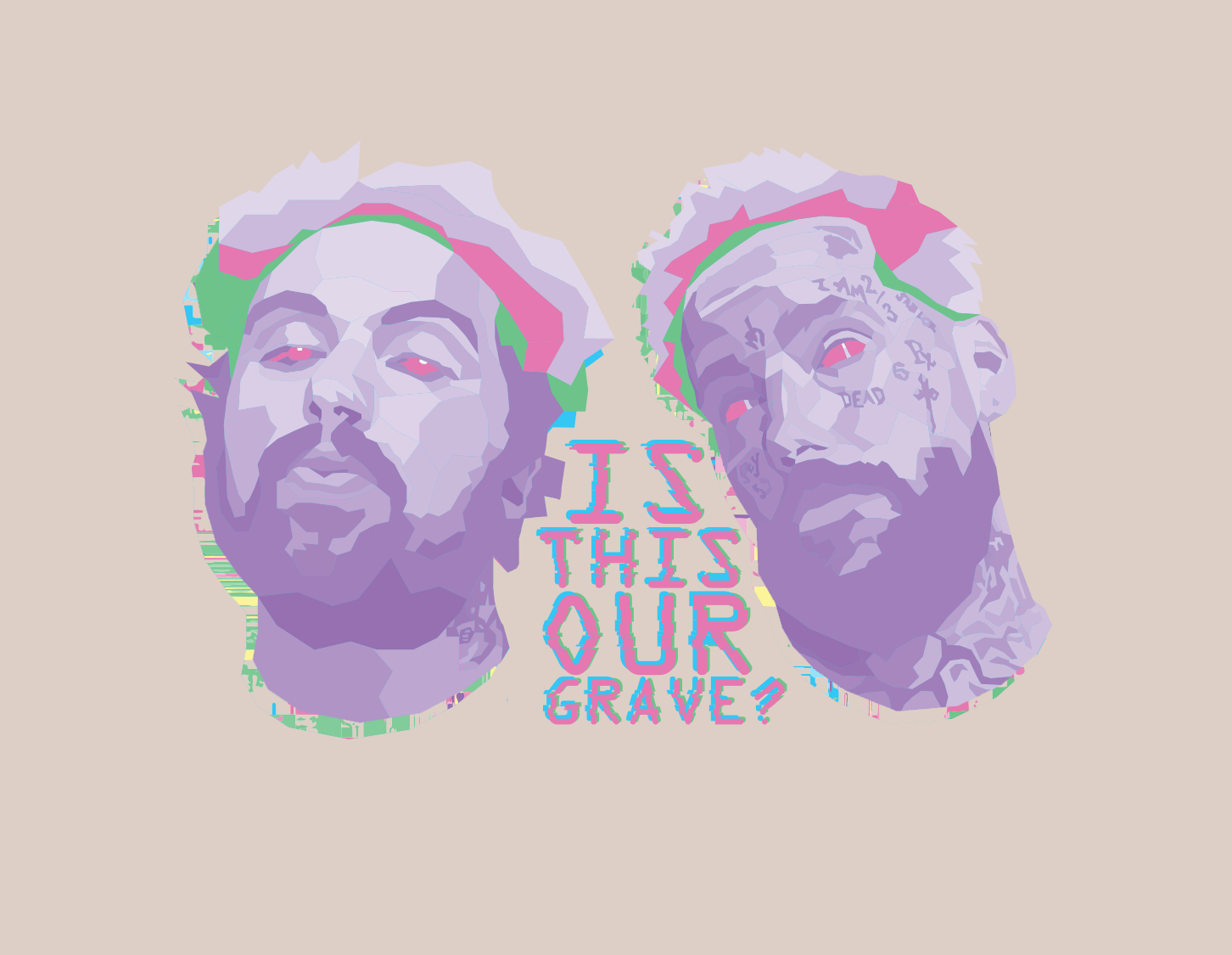
Case Study: Vinyl
Subject
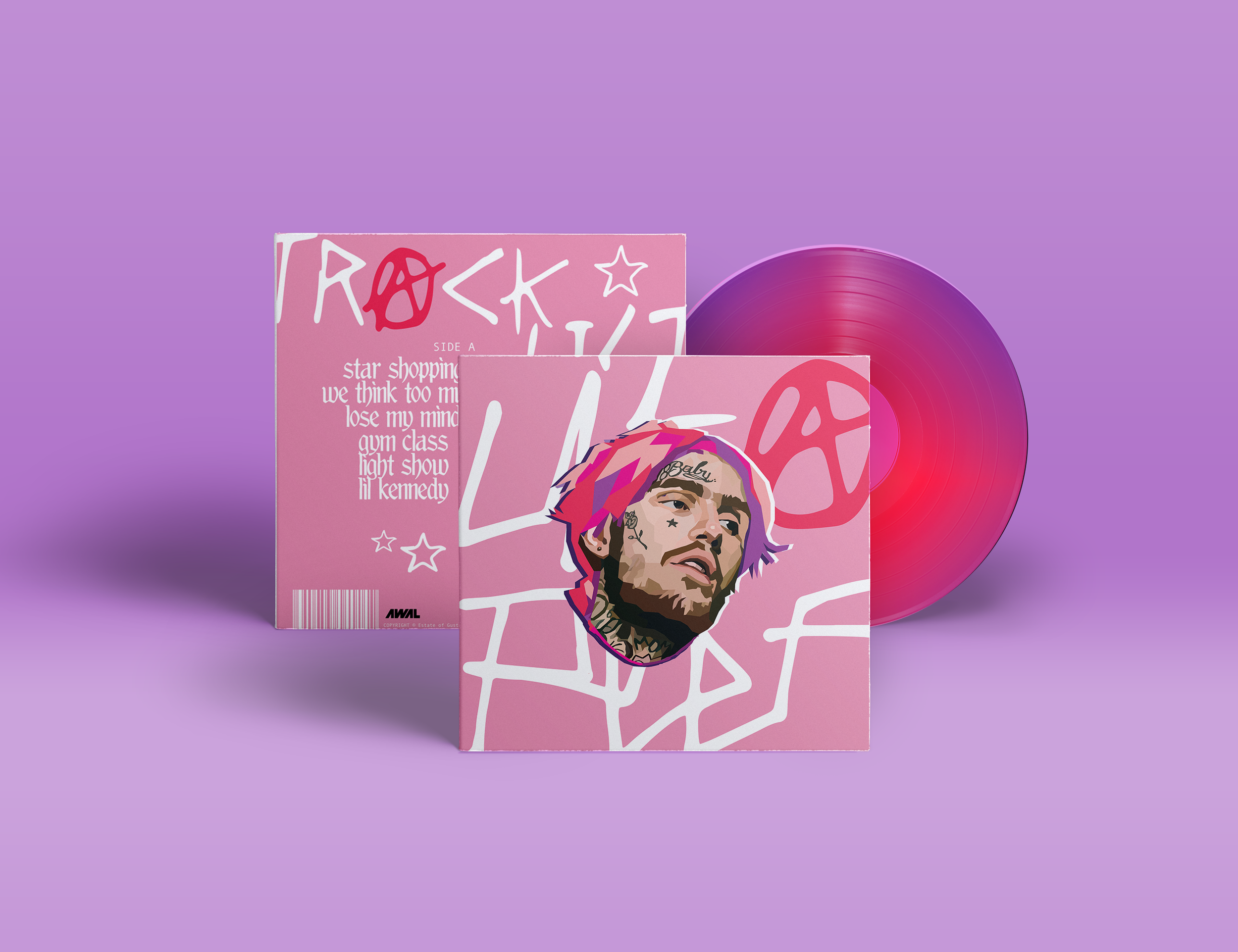
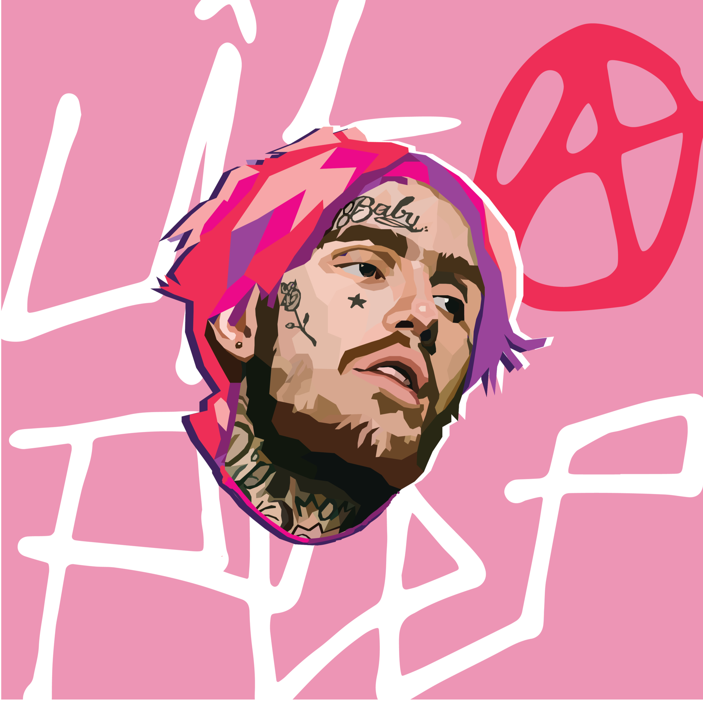
Gustav Åhr (Lil Peep)
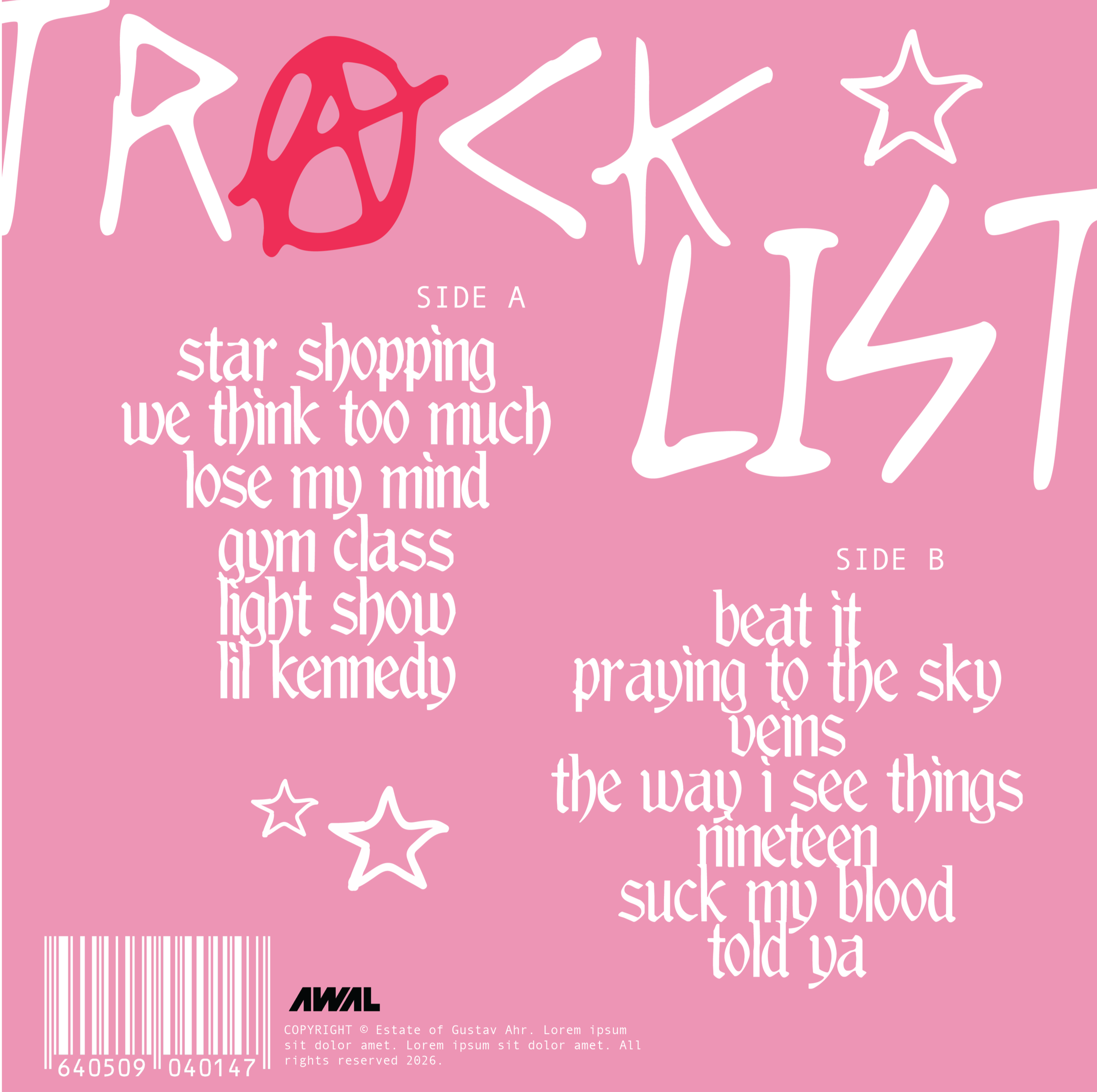
This vinyl design was a passion project inspired by the emotional highs and lows creatives face throughout their careers. It serves as a tribute to the late Lil Peep, featuring a curated collection of his deep cuts while capturing his persona through bold visuals and vibrant colorways. Born Gustav Åhr in Allentown, Pennsylvania, Lil Peep built a prolific musical catalog before his passing in 2017, leaving a lasting mark on underground music and culture.
The concept began with a geometric portrait of the artist, created with Procreate and Adobe Photoshop. The vinyl mockup was developed in Adobe Illustrator using a combination of typography elements. A stylized rendition of Lil Peep’s logo anchors the front cover, while Overly Obsessed Girlfriend by Maya TD and the gothic typeface Moderna feature on the back. The color palette reflects his ever-evolving aesthetic and boundary-pushing style. The design aims to evoke nostalgia, translating the raw energy of his music into a visual experience that feels both personal and enduring.
Portrait Series
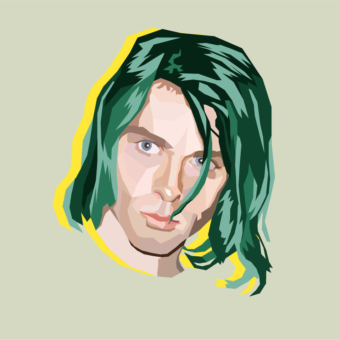
Kurt Cobain: Even in bold shapes and layered color, he still feels vulnerable. That balance was the heart of this piece. The angles are sharp, but the expression carries the weight.
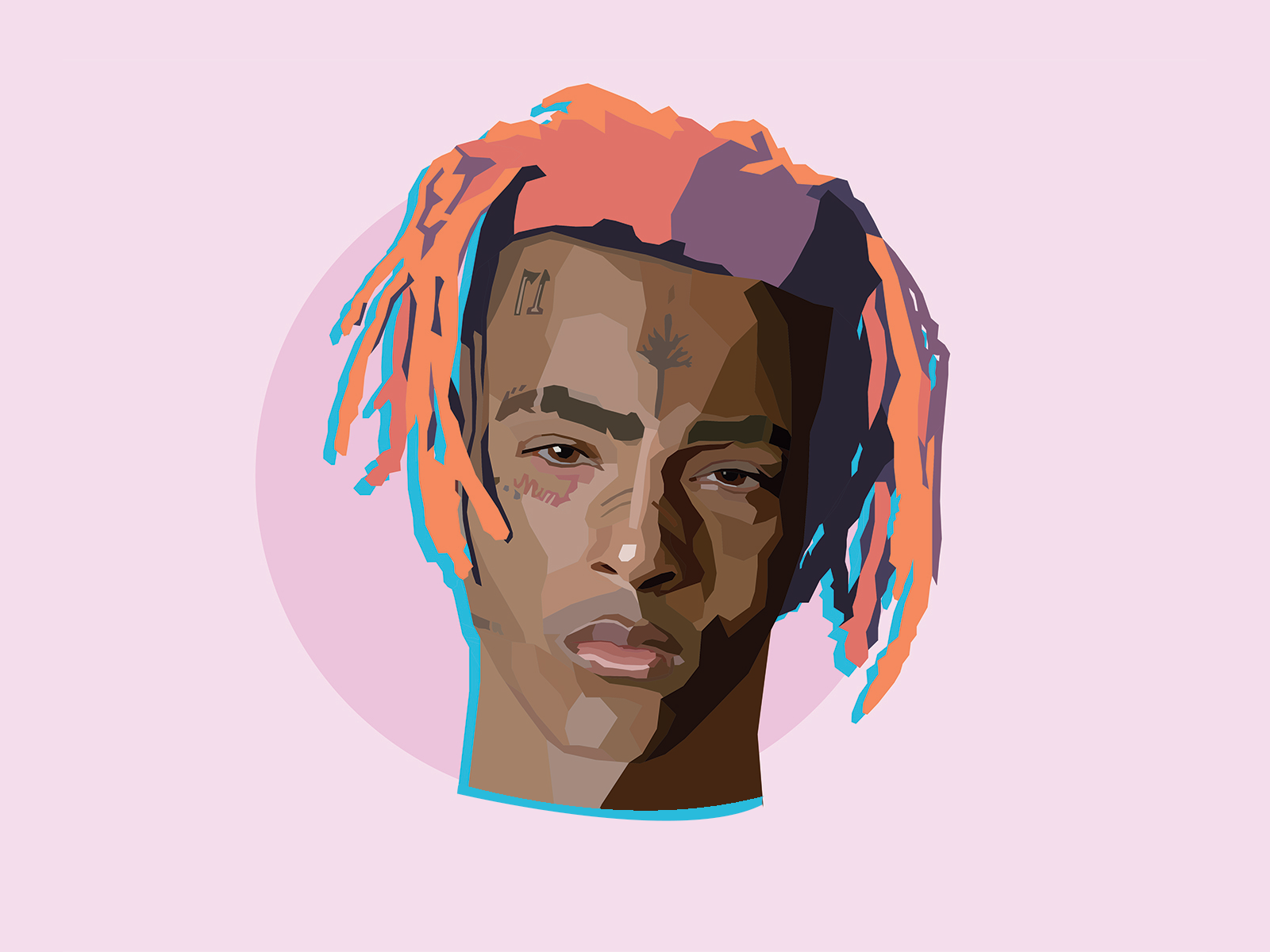
XXXTentacion: This portrait was designed to reflect the emotional weight he carried in his music. The split light and shadow nod to the contrast between the sensitivity and intensity that defined him.
$UICIDEBOY$: The digital noise and neon color palette is intended to echo the rawness of their sound. This design leans into distortion and contrast - a small nod to the darkness that they’ve turned into art.
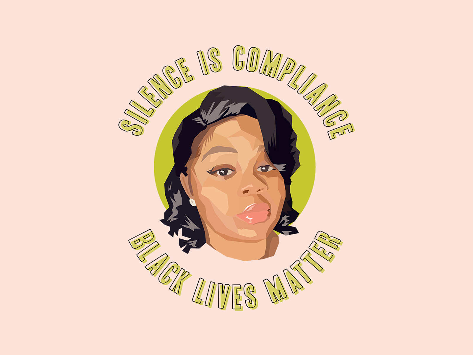
Breonna Taylor: She is placed at the heart of this design, both visually and symbolically. The muted color palette, alongside pops of green, creates a quiet sense of reflection, allowing her presence to remain the focus while the surrounding message ensures that her story will never fade.
YouTube: Shyla Renae
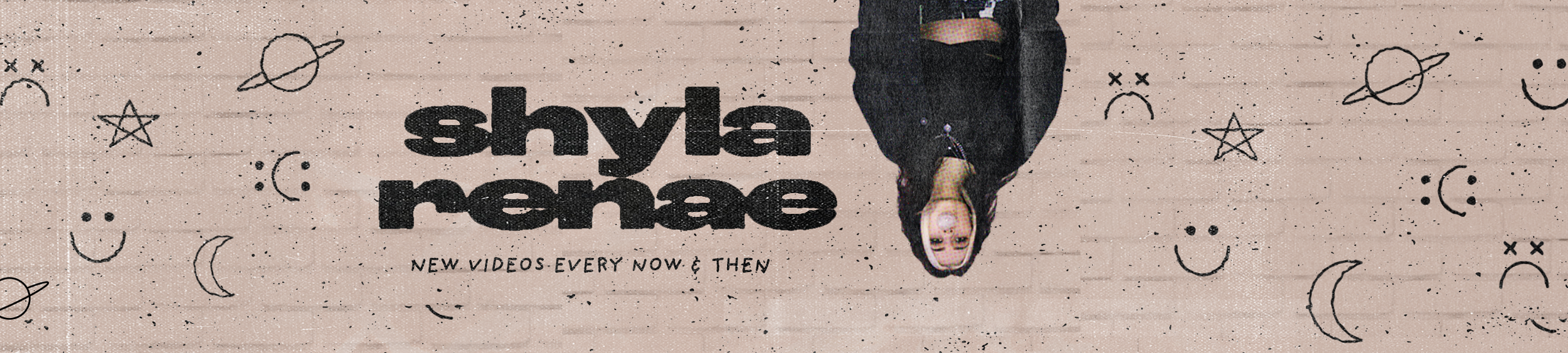
This banner was designed for YouTuber Shyla Renae, capturing her unfiltered, offbeat energy as a lifestyle creator and concert photographer. The upside-down portrait and gritty texture aims to make an instant statement. The hand-drawn elements pay homage to her hand tattoos, while the typography, featuring typefaces Roc Grotesk and Providence Sans, intend to reflect the raw world she moves in.
Case Study: Package Design
Brand
NoFo Brewing Co.
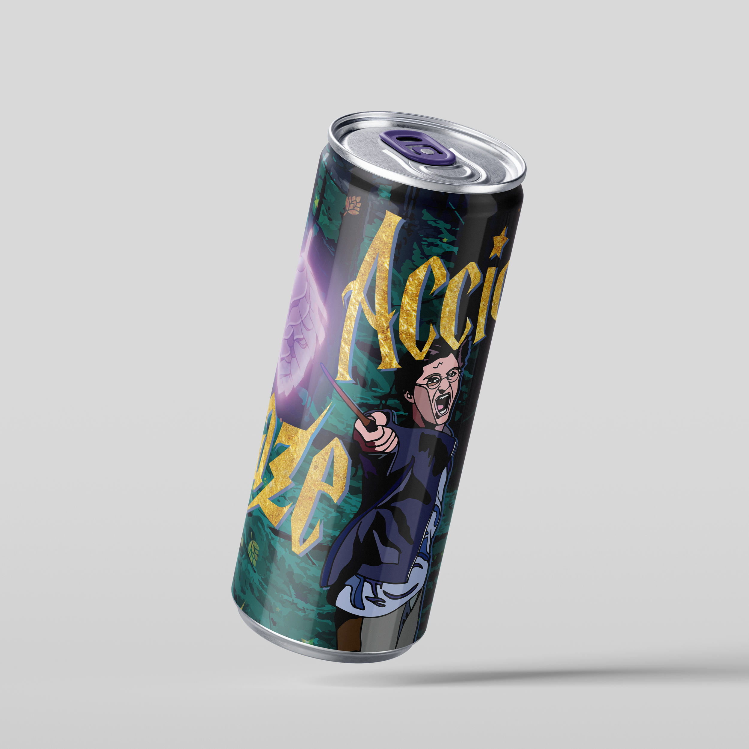
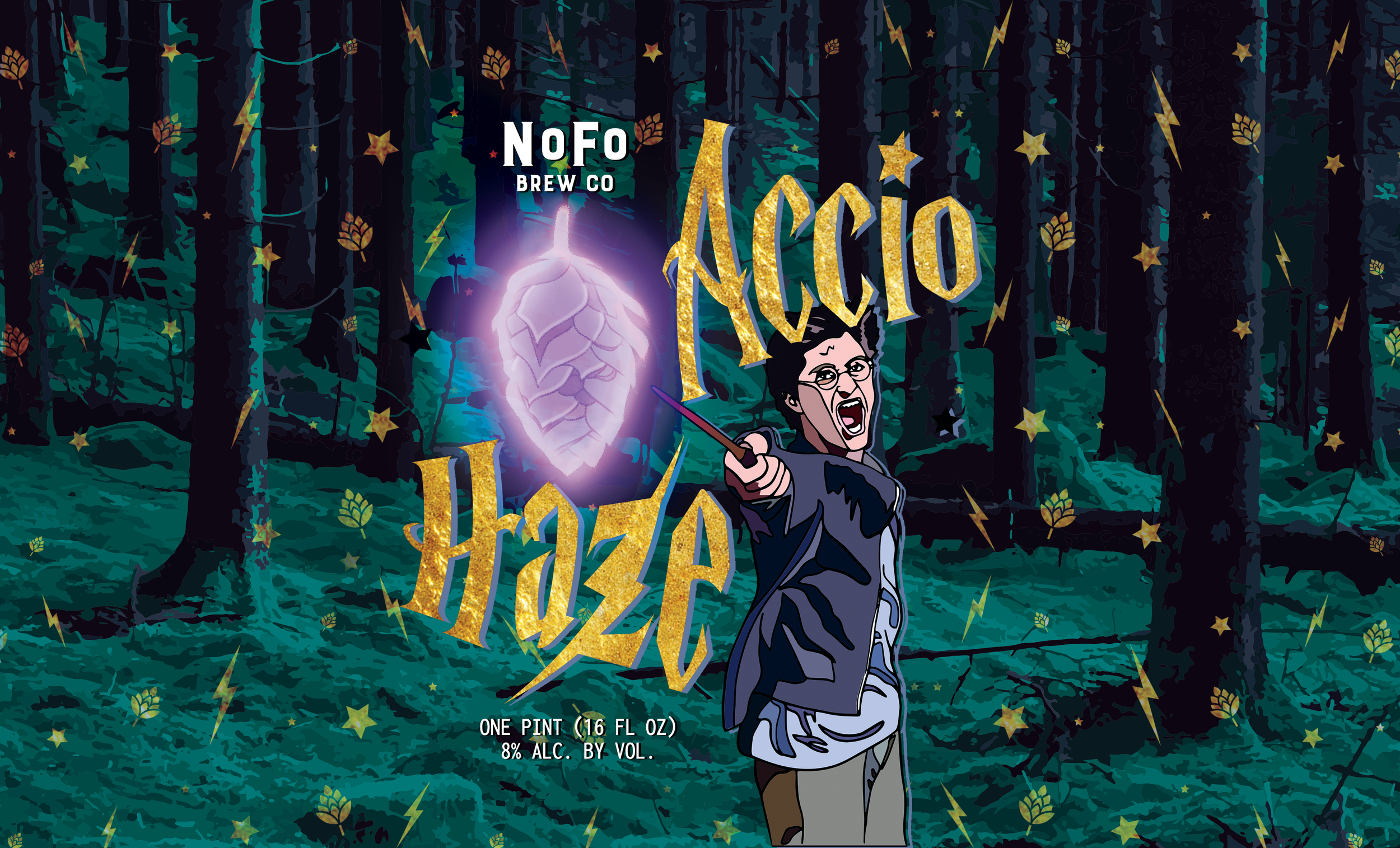
This design (though ultimately scrapped due to copyright issues) playfully nods to the Harry Potter series with whimsical hand-drawn elements, rich jewel tones, and magical gold accents. At the center, “The Boy Who Lived” conjures a hop-shaped Patronus in the Forbidden Forest, while the typography stays true to the series’ original lettering. The background pattern weaves together key visuals, like hops and lightning bolts, blending NoFo Brewing Co.’s beer-brewing mastery with the magical world of Hogwarts.
The craft beer, Accio Haze, is a New England-style IPA, created as a limited-release product for NoFo Brewing Co.
Full can wrap design
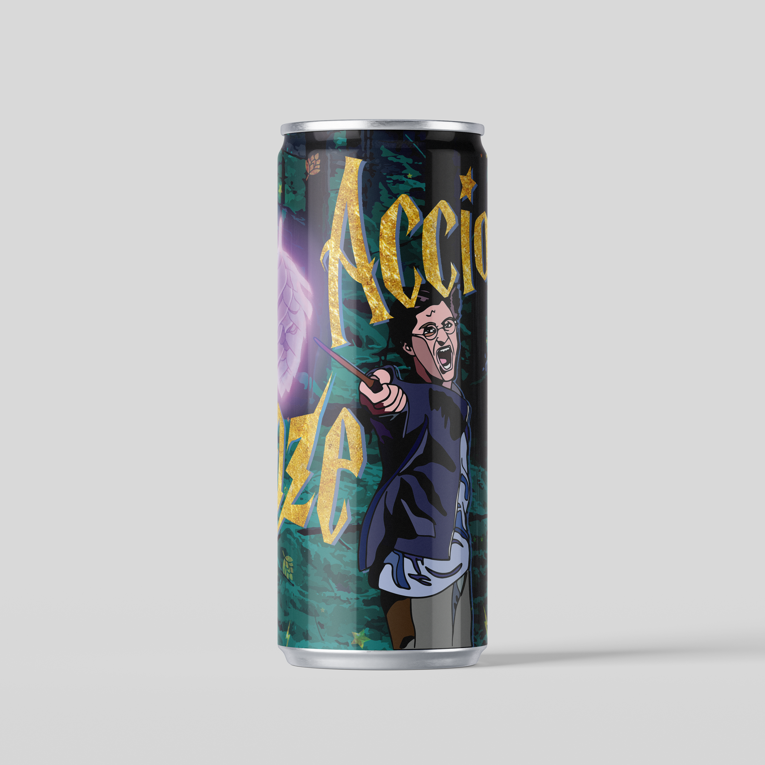
Alternate can angle