Hollister Co. Graphic Apparel Brief
A speculative women’s graphic apparel collection developed for a Hollister interview exercise. The Fall/Winter 2026 capsule translates customer and trend research into eight coordinated styles, from initial concept through final garment mockups.
Overview
Title: Love Notes & Road Trips
Season: Fall/Winter 2026
The brief called for a trend-aware collection for Hollister’s Gen Z customer: high school seniors and college freshmen who value comfort, self-expression, and clothing that feels authentic to their lives.
Love Notes & Road Trips draws from the romance and nostalgia of being young, from handwritten notes to spontaneous drives and the places remembered afterward. Vintage references and familiar symbols give the collection a lived-in quality while keeping it grounded in Hollister’s casual, youthful point of view.
Scope
The project covers the full design pipeline as a single designer, mirroring a real seasonal workflow. Includes research, concept direction, illustration, typography and color story, and mockups.
Role: Graphic Apparel Designer
Deliverables: Six tees and two fleece styles
-
I built a customer profile and reviewed trend forecasting alongside vintage and thrift references collected in Atlanta and Asheville. The research surfaced Y2K nostalgia, analog culture, and renewed interest in clothing that feels personal rather than overly polished. Those themes shaped the collection’s relaxed silhouettes, tactile graphics, and fall palette.
-
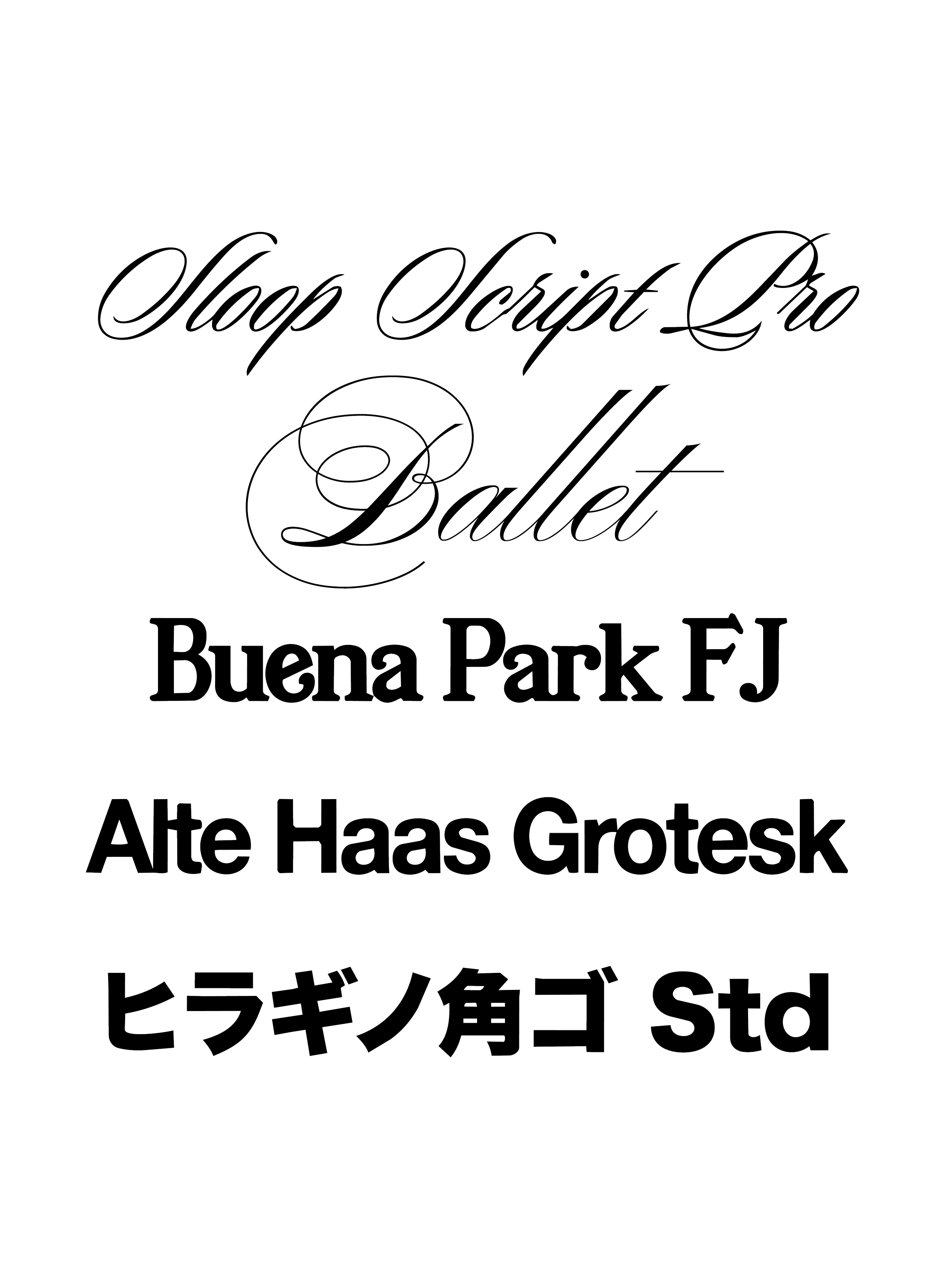
I developed the research into one seasonal story supported by a focused color palette and flexible typographic system. Romantic scripts, bold sans serifs, halftones, ink bleed, and photocopied textures give the artwork a nostalgic edge without making it feel costume-driven.
-
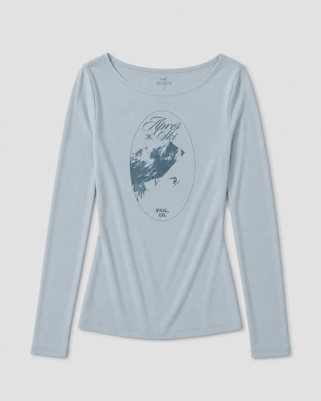
I designed five graphic tees and three fleece styles, moving between simple logo treatments and more detailed type-and-image compositions. Print, embroidery, and knit-inspired effects add variety across the assortment, while repeated colors, textures, and visual references keep the pieces connected.
-
Each design was applied to a garment mockup with attention to silhouette, fabric, scale, and placement. The goal was to present the artwork as a believable retail collection rather than a set of isolated graphics.


Color & Type
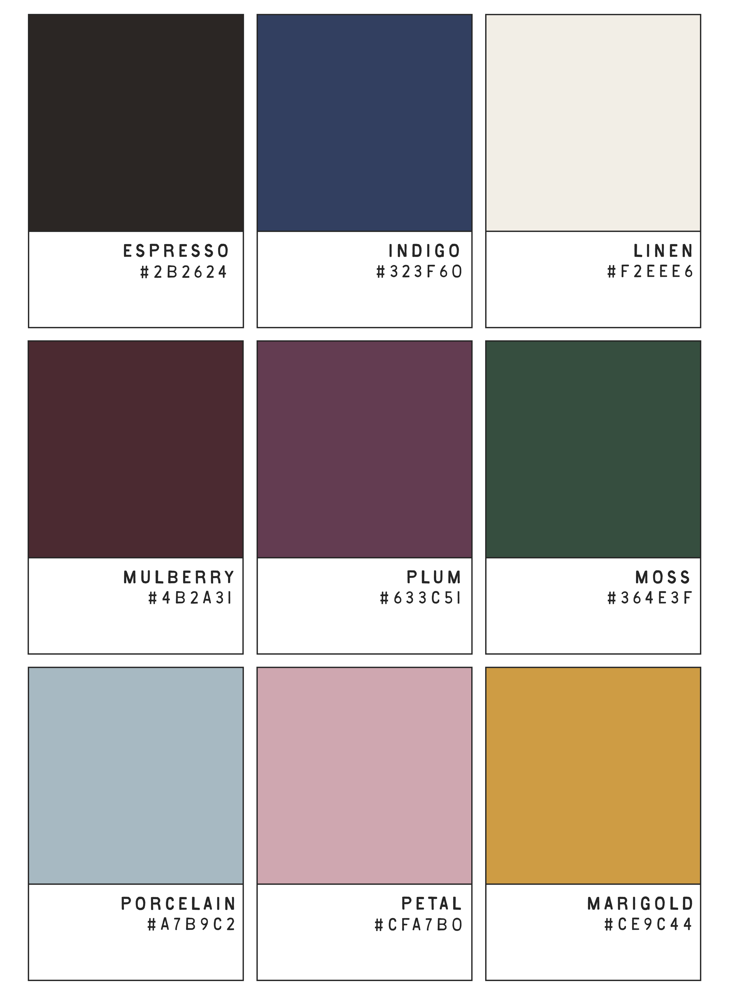
The palette pairs deep fall tones such as forest green, espresso, maroon, and plum with softer accents of dusty pink, icy blue, cream, and marigold. Expressive scripts and serif faces bring romance and nostalgia to the system, while clean sans serifs keep it aligned with Hollister’s casual graphic language.
Reflection
This project made me think less about individual graphics and more about how a full assortment works together. The hardest part was pulling from Y2K and vintage references without losing Hollister’s existing voice. Working across print, embroidery, and knit-inspired treatments helped me create a collection that feels varied while still belonging to the same story.