
Necessary Behavior
New Boundaries. No Bullsh*t.
Necessary Behavior is a social impact organization that uses education and advocacy to make sensitive social and health topics easier to engage with. As Lead Graphic Designer, I built the visual identity and directed a seven-person junior design team. The work spanned print, digital, social, and merchandise, with a system flexible enough to shift across initiatives without losing the organization’s voice.
Scope
Brand Identity
Creative Direction
Campaign Design
Social Content
Illustration
Apparel Graphics
Brand System
I built the identity around a bold type system and flexible color palette, supported by simple graphic elements that could work across social posts, merchandise, and educational materials. The goal was to make difficult topics feel clear and approachable without softening the message.
-
The lemon came from Necessary Behavior’s willingness to be seen as “sour” for speaking openly about injustice. Its familiar shape made the brand easy to recognize and gave serious topics a more approachable entry point.
-
Albra (a serif type) gave campaign headlines a strong editorial feel, while Gopher (a sans-serif type) kept longer educational content clear and easy to read.
-
Citron tied the palette to the lemon mark and gave the brand a bright, recognizable base. Apricot added warmth. Glacier softened the palette, while Sage and Juniper gave heavier topics more depth.
-
The identity paired direct copy with bold color, illustration, and humor. Each campaign could shift in style while still feeling connected to Necessary Behavior.


Color Story
Campaign Design
I created campaigns around Pride, vaccination awareness, community education, and broader advocacy. Each used its own palette and references while staying connected through direct messaging, bold typography, and recurring graphic elements.
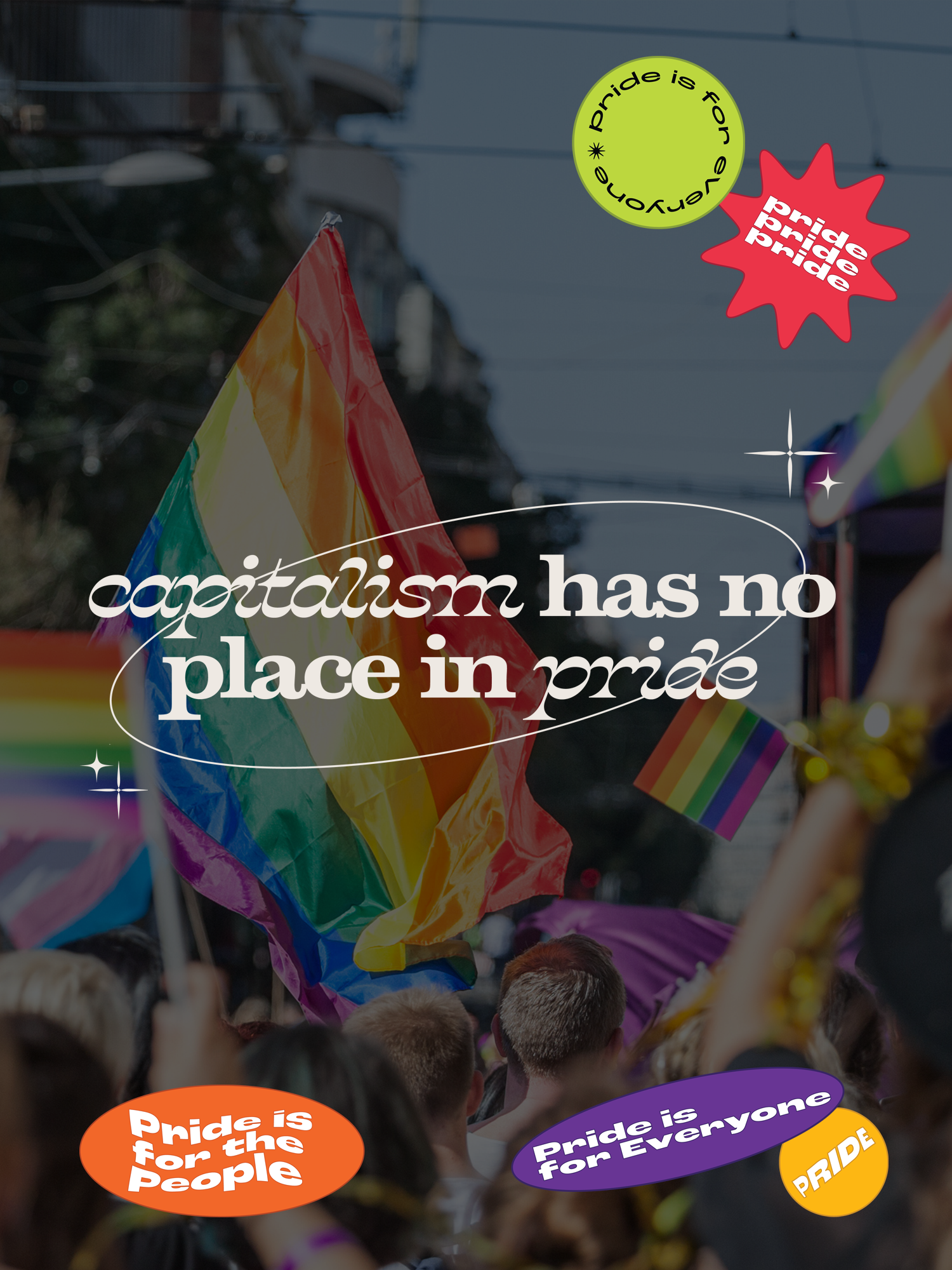
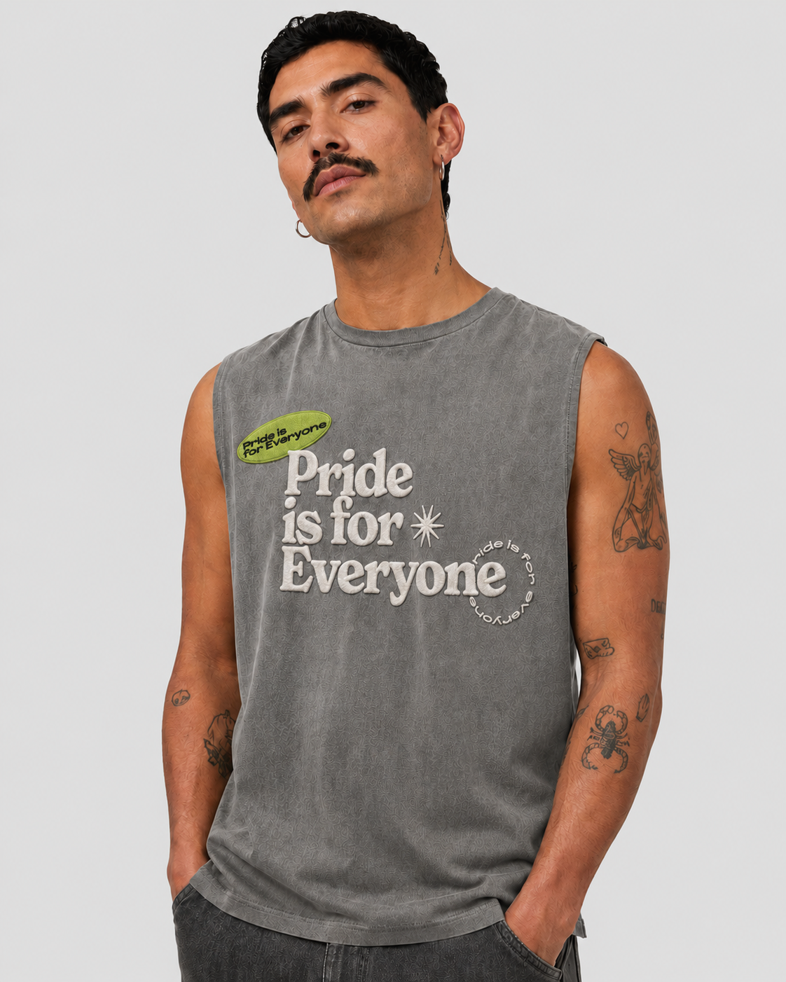
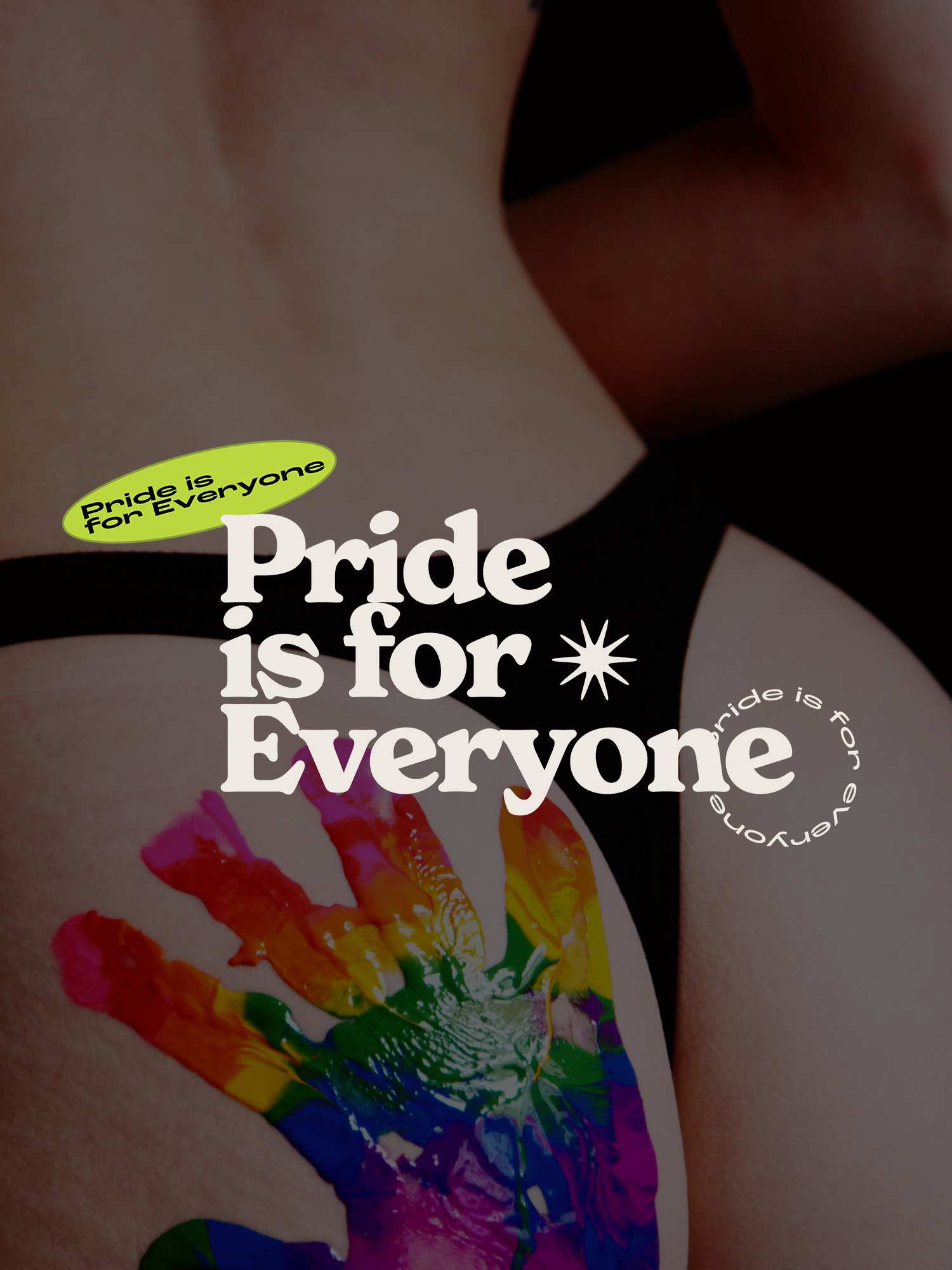
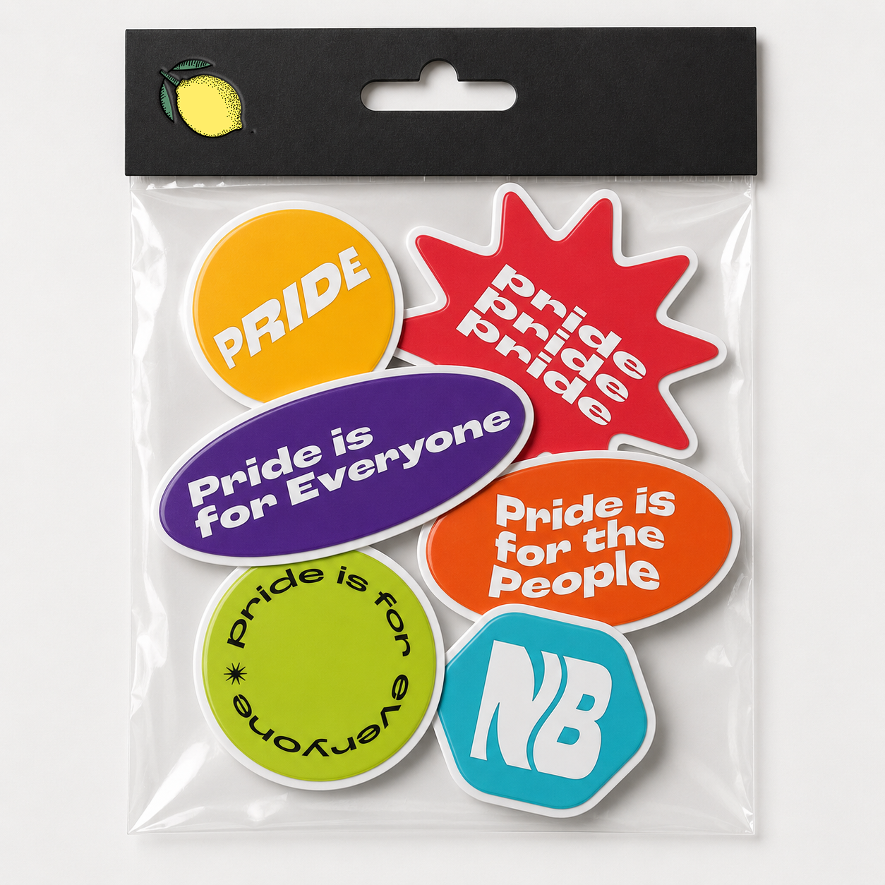
LGBTQ+ Pride Month Collection
I built the Pride campaign around orange, purple, lime, red, and blue instead of a standard rainbow palette. Expressive serif type, heavy sans serif slogans, sticker shapes, and layered graphics drew from protest signage and queer youth culture. Community photography kept the campaign grounded in real people, while the same graphics carried across apparel, stickers, hats, and social content.
-
Build a celebratory Pride Month campaign that raised the organization’s visibility and showed clear support for the LGBTQ+ community across digital and physical touchpoints.
-
LGBTQ+ people and allies, with a focus on younger audiences who expect meaningful support beyond surface-level messaging.
-
Social media assets, apparel, accessories, limited-edition merchandise, and supporting brand collateral, all built from the same color and type system.


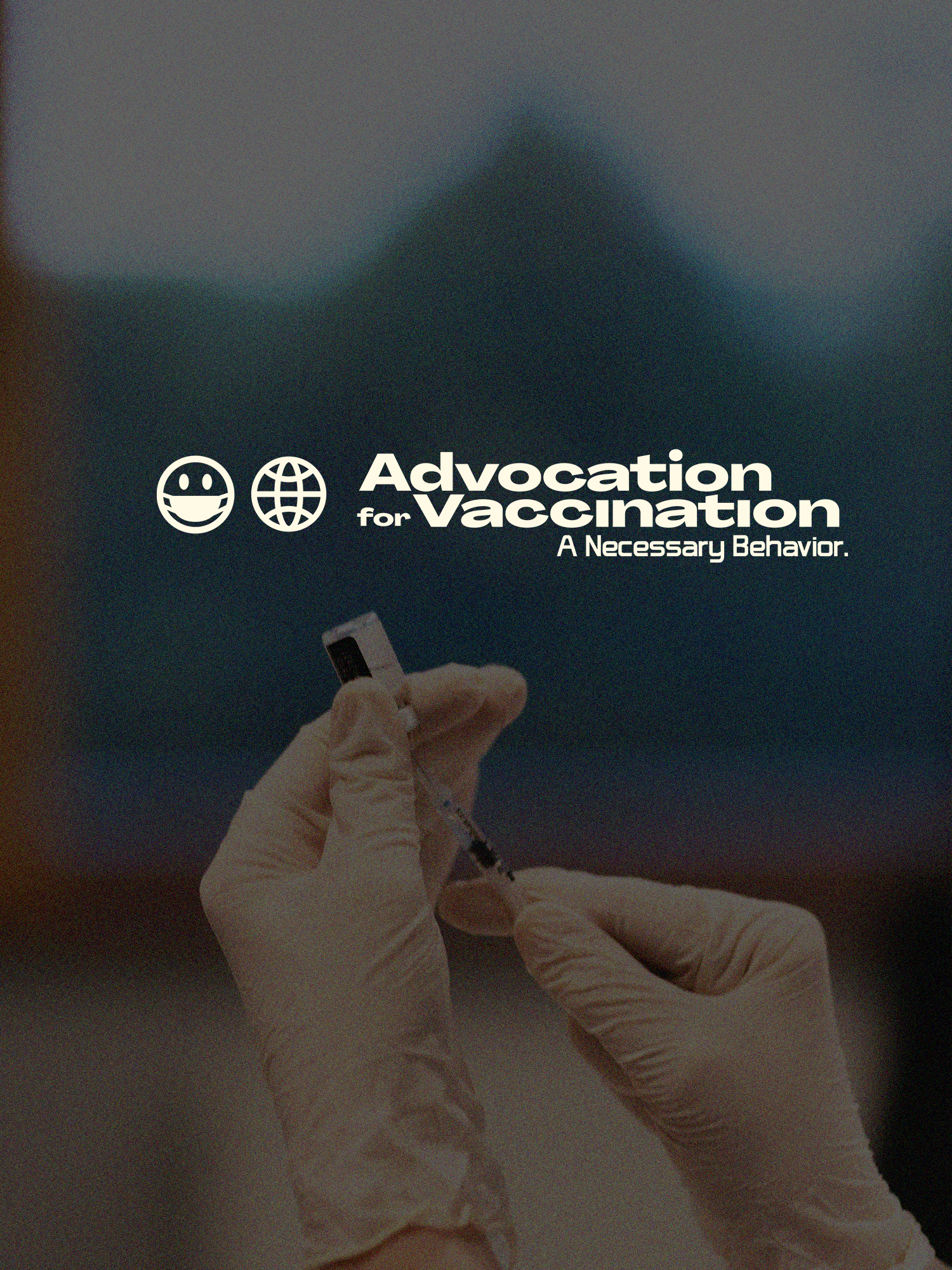
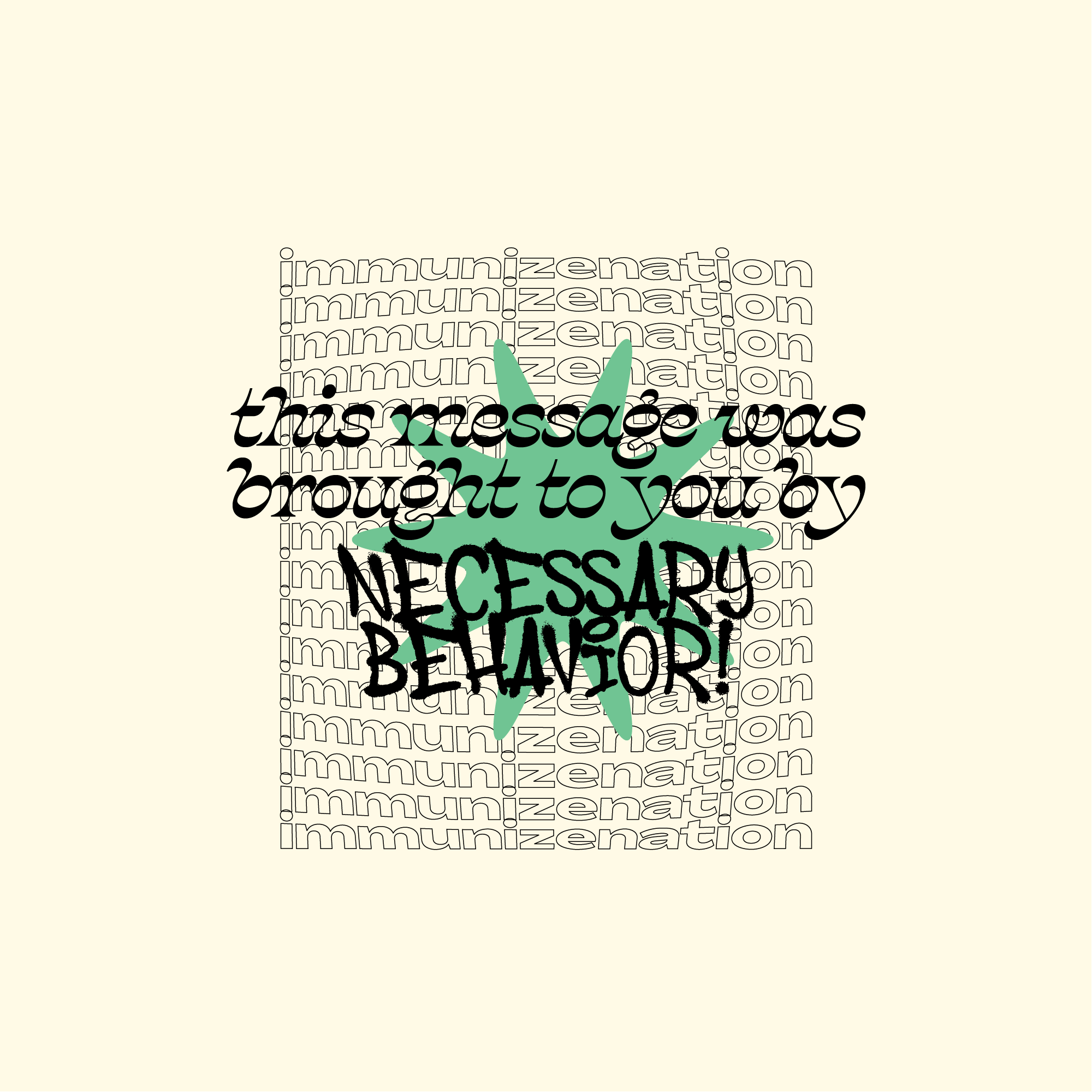
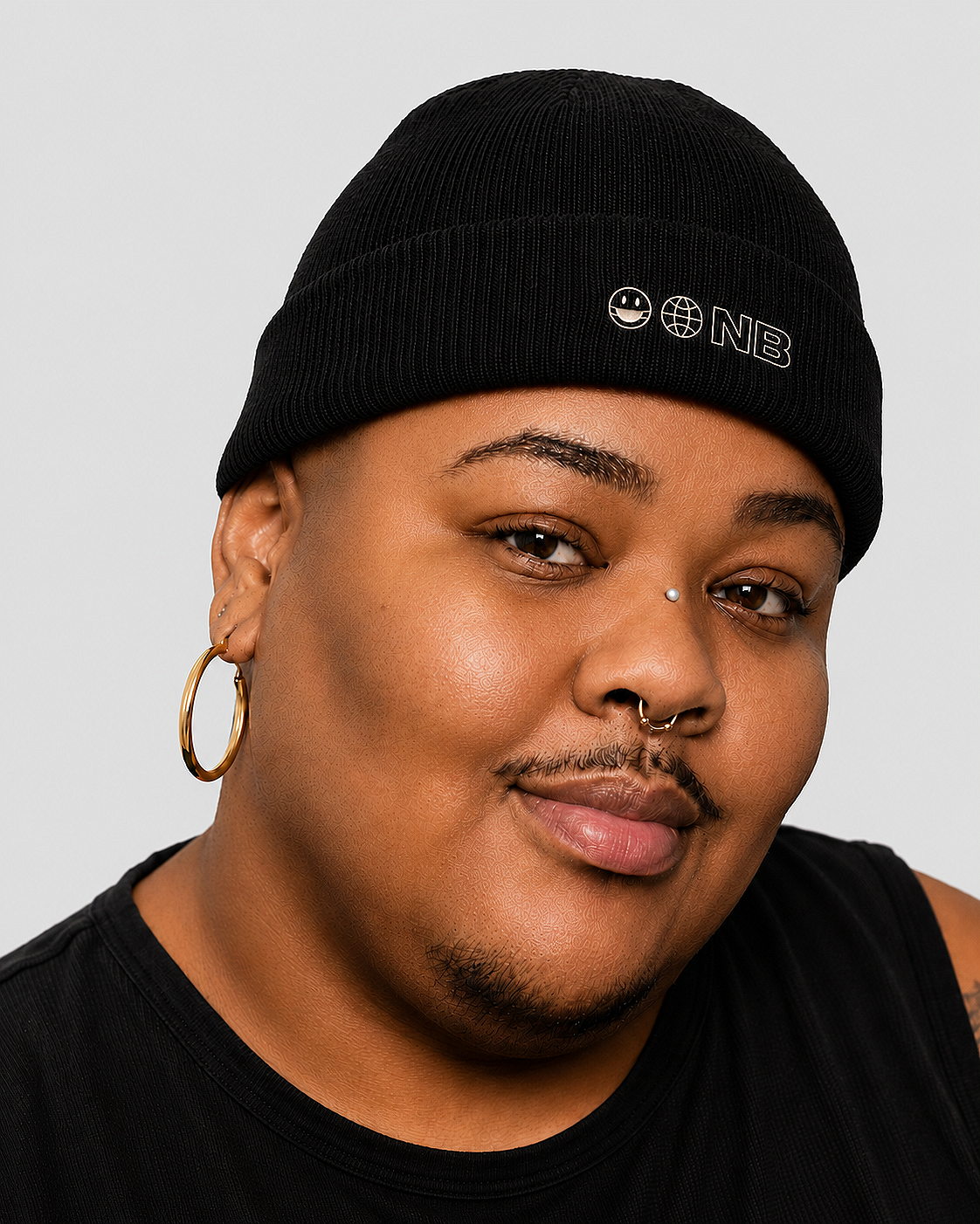
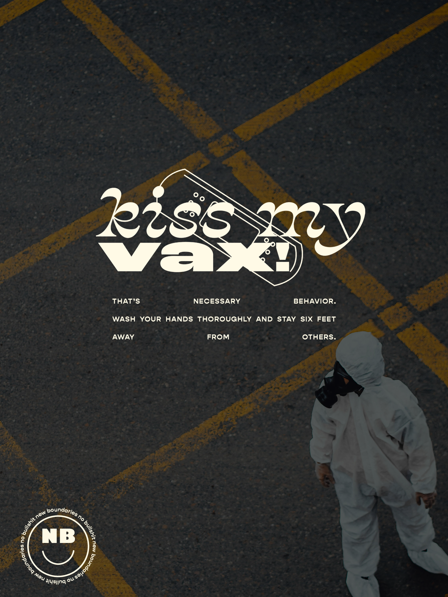
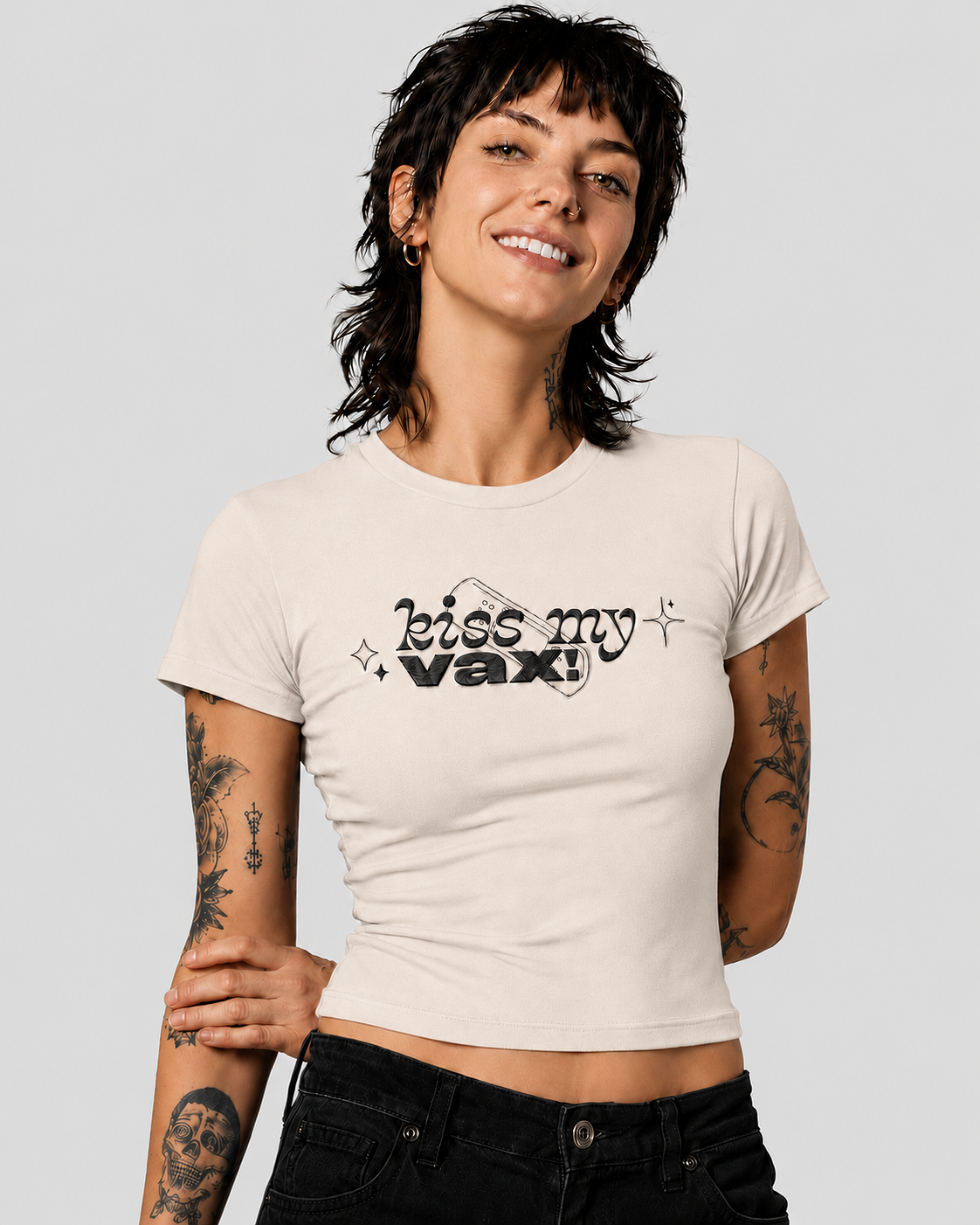
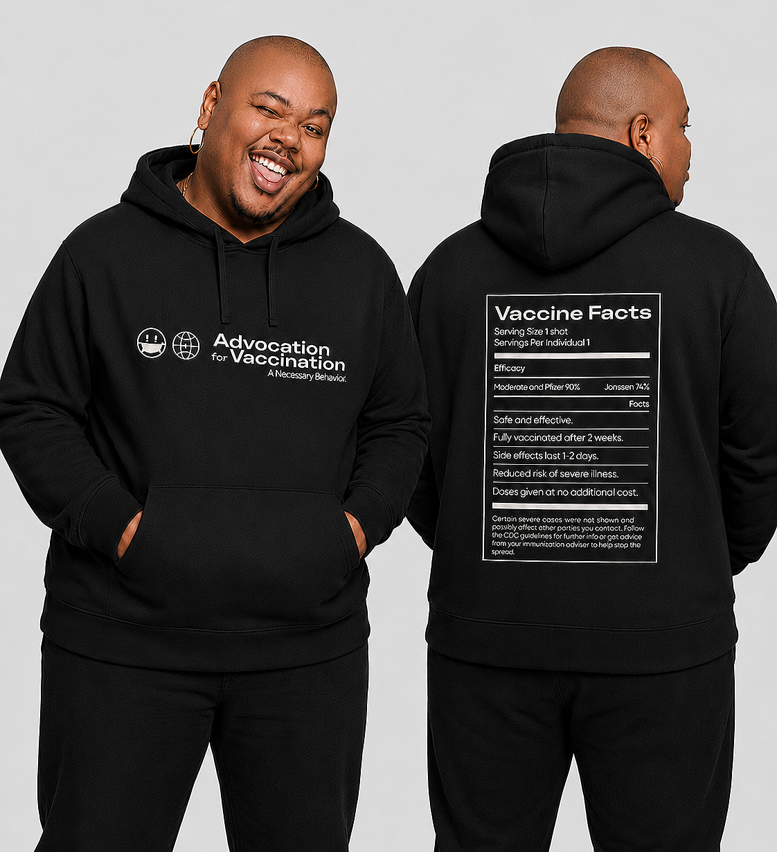
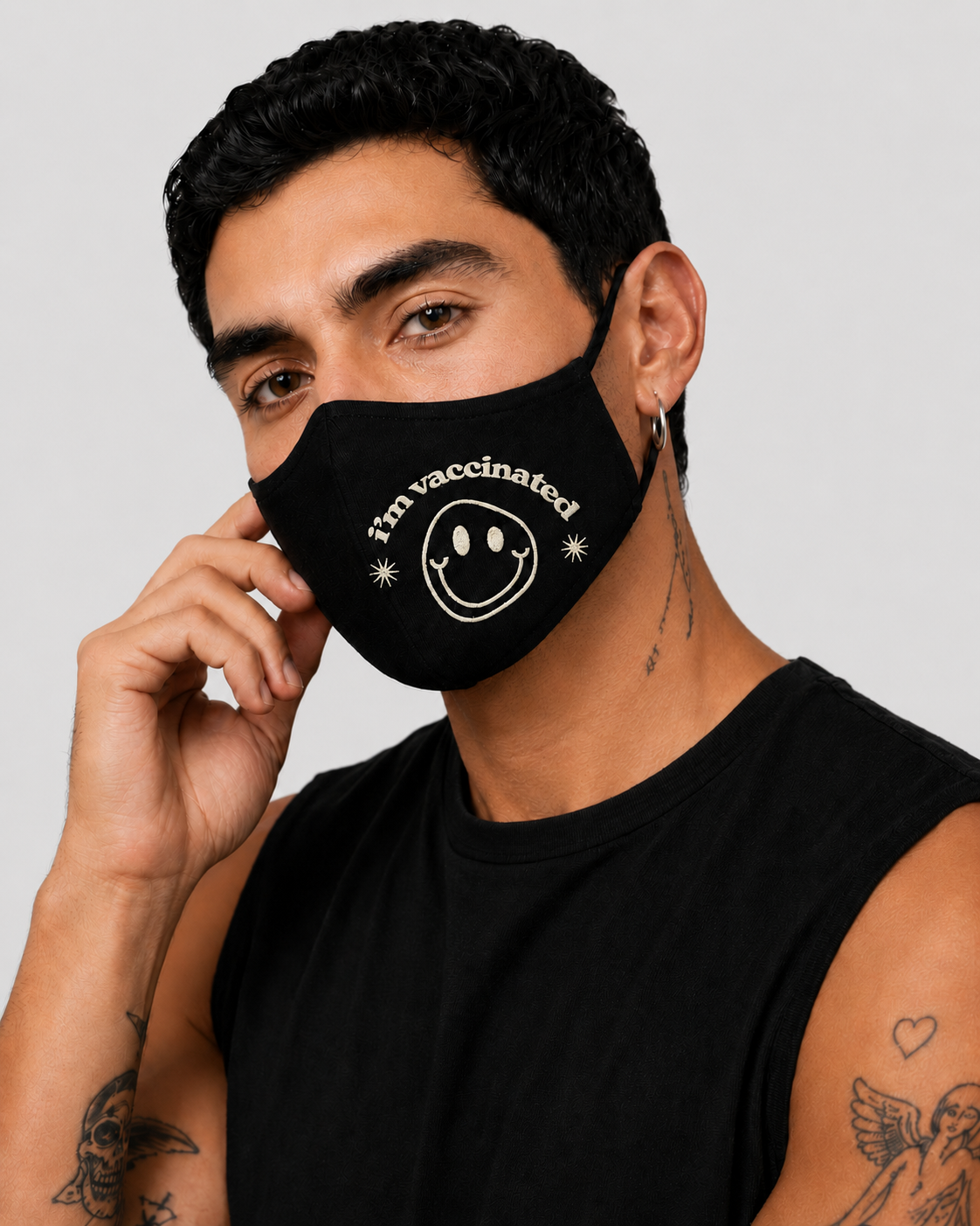
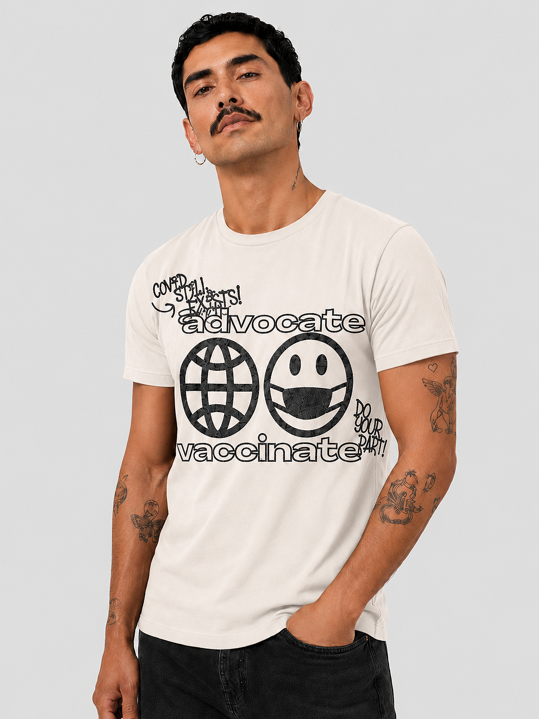
“ImmunizeNation” COVID-19 Collection
I built ImmunizeNation around a limited palette of black, cream, and green, with bold sans serif type and simple repeating graphics. The pared-back direction gave the campaign a fashion-led feel, while direct copy made the vaccine message clearer and more approachable for a younger audience.
-
Encourage young people to get vaccinated through a merchandise-led campaign that framed vaccination as an act of community care.
-
Teens and young adults who engage with fashion and social content and respond to messaging that feels current and direct.
-
A line of apparel and accessories supported by social graphics and promotional content, all built from one shared visual system.

Ongoing Brand Work
Ongoing work that extended the identity beyond larger campaigns, including social posts, podcast artwork, stickers, merchandise, and advocacy graphics. Each piece responded to a different topic while maintaining Necessary Behavior’s overall visual voice.

Cover art for Necessary Behavior’s podcast on sex, relationships, and bodily autonomy.
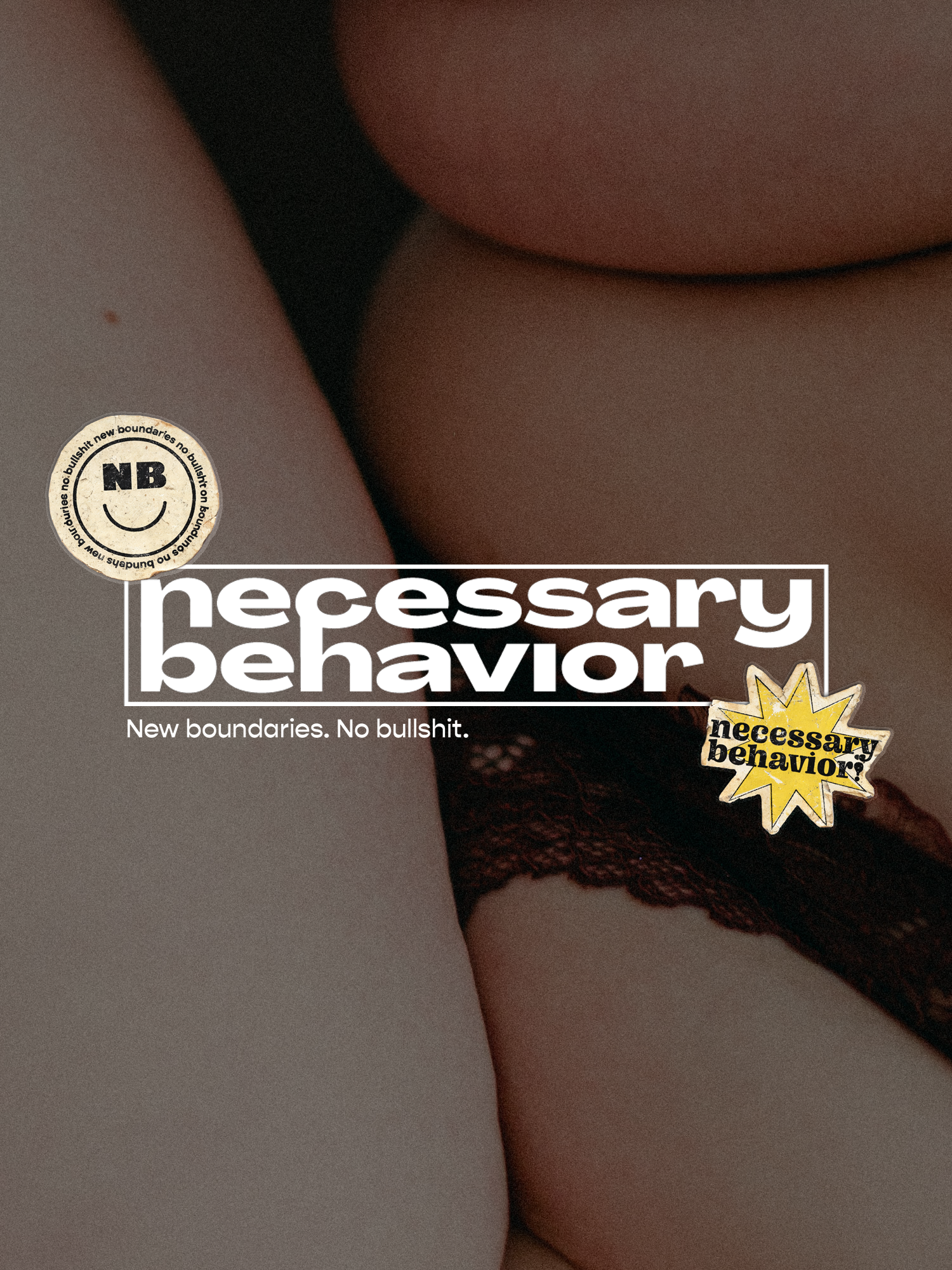
A social post centered on body neutrality, pairing intimate photography with direct messaging that encourages a more accepting relationship with the body.
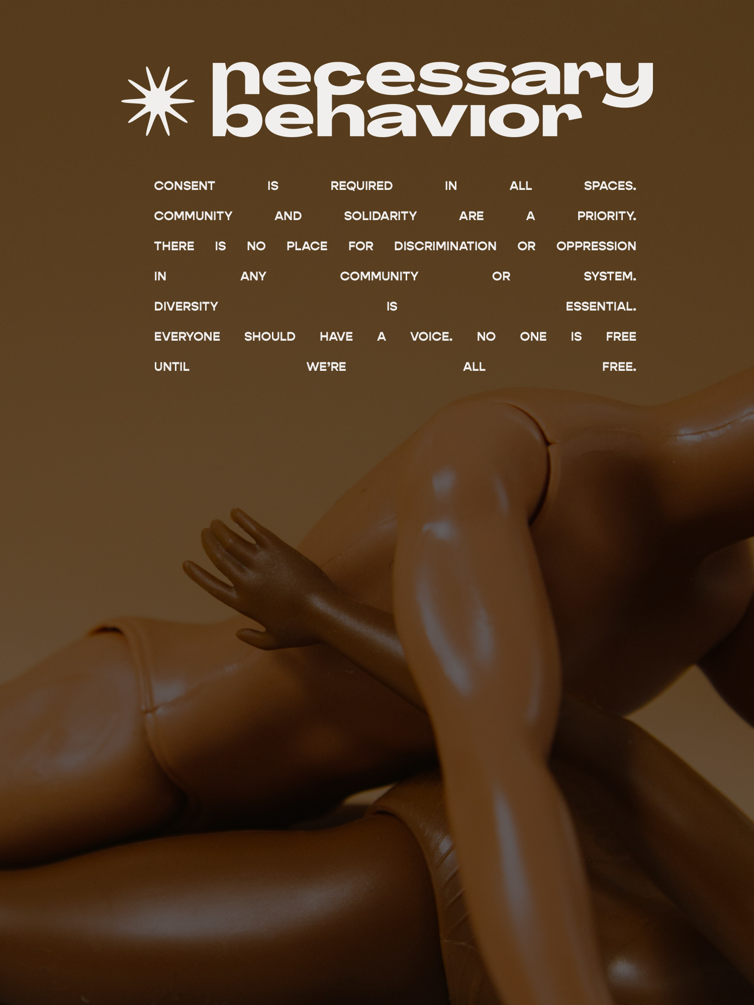
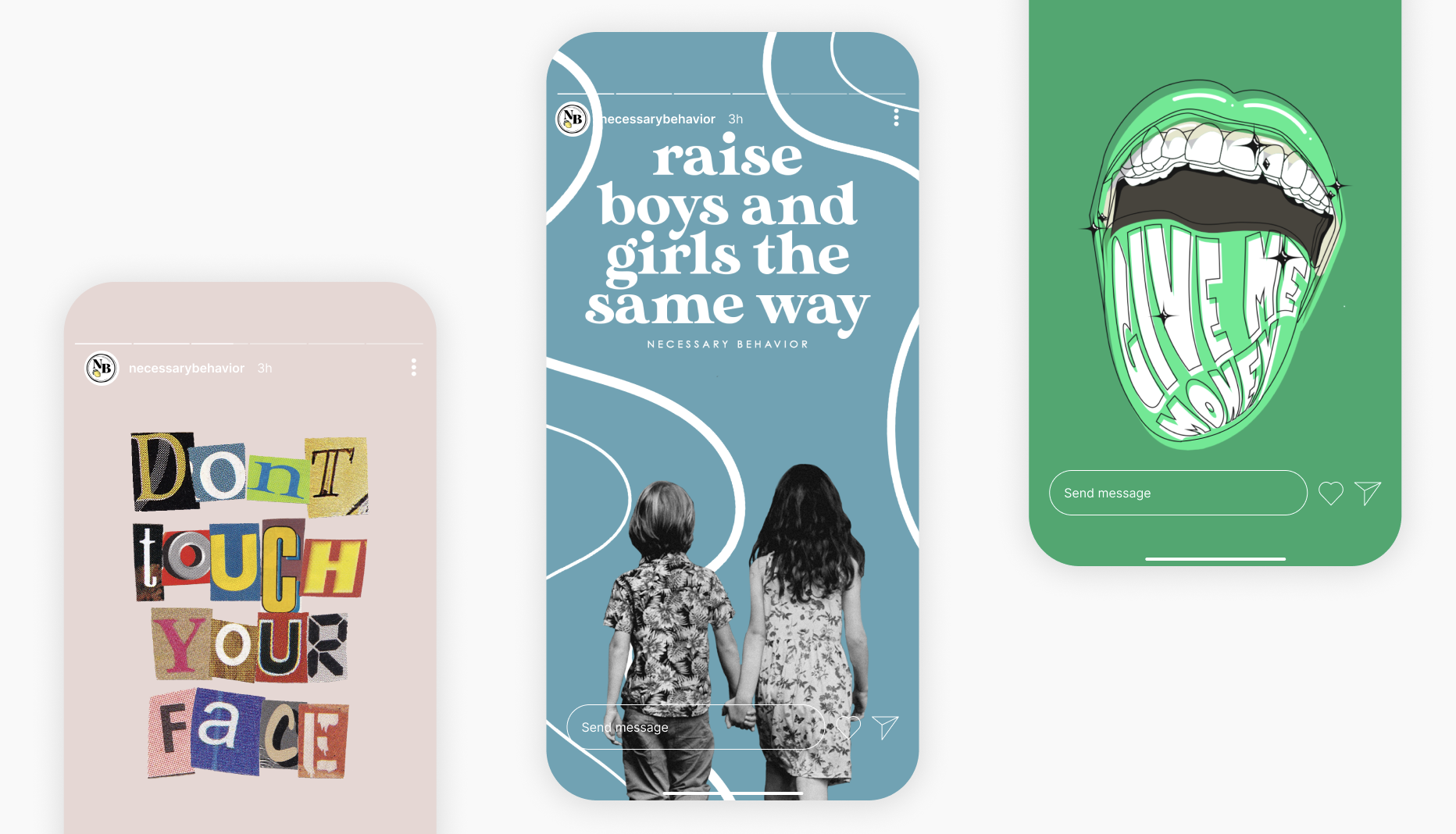
A text-led social graphic outlining the organization’s values, paired with abstract imagery that subtly references intimacy, sexuality, and queer identity.
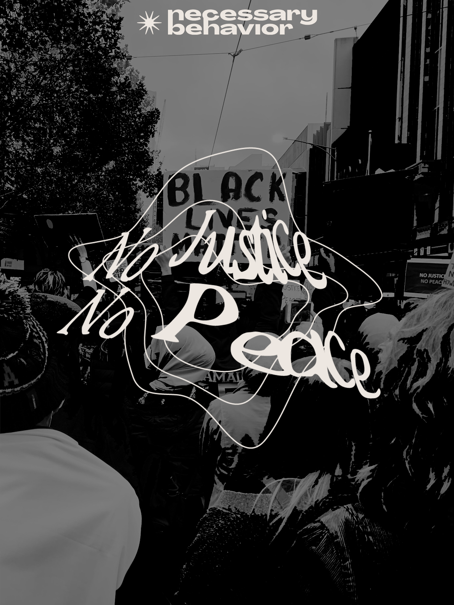
An advocacy graphic combining protest photography and expressive lettering to support racial justice messaging.
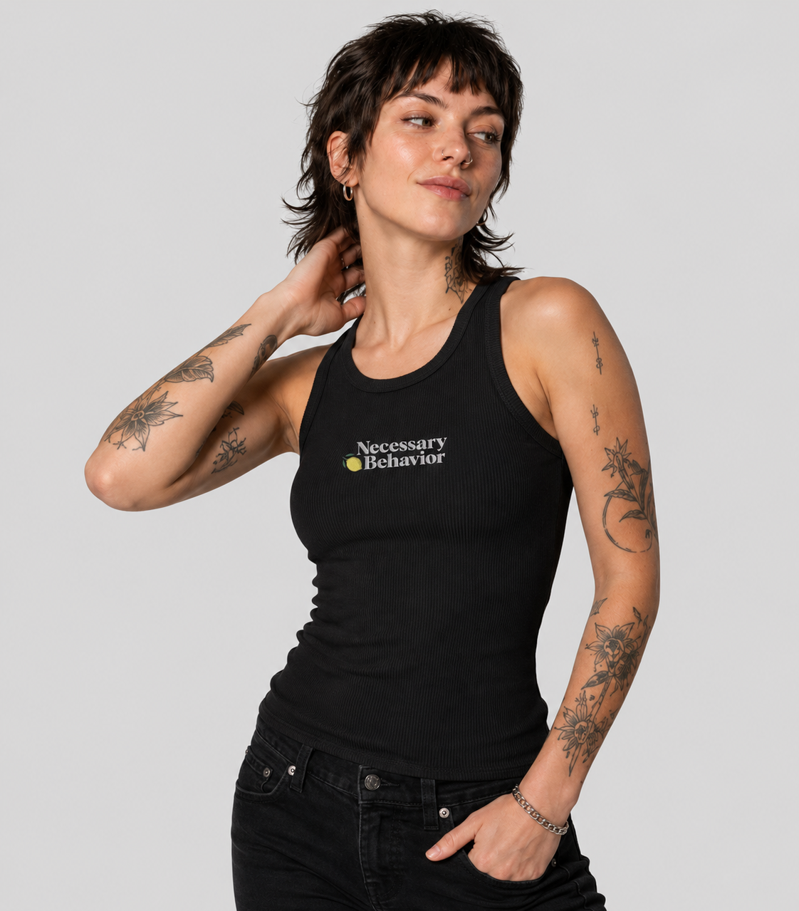
Core logo embroidered on a black tank for the organization’s ongoing merchandise line.
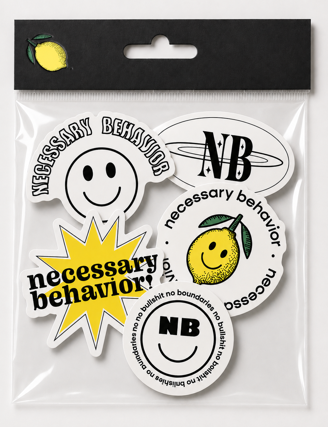
A sticker set developed for merchandise, packaging, events, and community outreach.
Wallpaper Wednesdays
A recurring Instagram Story series of downloadable phone wallpapers that extended the brand into something followers could save and share.
Reflection
Working on Necessary Behavior taught me how to build a brand system that could stay recognizable across very different campaigns. Each initiative needed its own tone, especially when the subject matter ranged from Pride to vaccination awareness and sexual wellness. I learned to keep the core voice and visual cues consistent while giving each campaign enough room to feel specific to its audience. It also taught me that making a difficult topic accessible does not mean softening it; it means finding the clearest way into it.